library(tidyverse)
library(ggimage)
library(ggtext)
library(showtext)Libraries
Data visualisation was primarily performed using the ggplot2 package and ggimage was required to include country flag images in the chart.
Data
wc2026 <- data.frame(
  country = c("Czechia", "Mexico", "South Africa", "South Korea", "Bosnia and Herzegovina", "Canada", "Qatar", "Switzerland", "Brazil", "Haiti", "Morocco", "Scotland", "Australia", "Paraguay", "Turkey", "United States", "Curaçao", "Ecuador", "Germany", "Ivory Coast", "Japan", "Netherlands", "Sweden", "Tunisia", "Belgium", "Egypt", "Iran", "New Zealand", "Cape Verde", "Saudi Arabia", "Spain", "Uruguay", "France", "Iraq", "Norway", "Senegal", "Algeria", "Argentina", "Austria", "Jordan", "Colombia", "DR Congo", "Portugal", "Uzbekistan", "Croatia", "England", "Ghana", "Panama"),
  group = rep(c("A","B","C","D","E","F","G","H","I","J","K","L"), each = 4),
  code = c("cz", "mx", "za", "kr", "ba", "ca", "qa", "ch", "br", "ht", "ma", "gb-sct", "au", "py", "tr", "us", "cw", "ec", "de", "ci", "jp", "nl", "se", "tn", "be", "eg", "ir", "nz", "cv", "sa", "es", "uy", "fr", "iq", "no", "sn", "dz", "ar", "at", "jo", "co", "cd", "pt", "uz", "hr", "gb-eng", "gh", "pa"),
  ranking = c(40, 14, 60, 25, 64, 30, 56, 19, 6, 83, 7, 42, 27, 41, 22, 17, 82, 23, 10, 33, 18, 8, 38, 45, 9, 29, 20, 85, 67, 61, 2, 16, 3, 57, 31, 15, 28, 1, 24, 63, 13, 46, 5, 50, 11, 4, 73, 34)
)
Initially, I wanted to use the ggflags package but it does not support the constituent countries in United Kingdom. Thanks to the availability of this circle flags gallery, we can create URL links to retrieve the svg image files based on the country codes above.
wc2026 <- wc2026|>
  mutate(
    url = paste0(
      "https://hatscripts.github.io/circle-flags/flags/",
      code,
      ".svg"
    )
  )
Fonts
The showtext package enables use of preferred fonts. To include the social media icons, you may download the otf file from here and include it in your working directory.
font_add_google("Roboto Condensed")
font_add(family = "fb", regular = "Font Awesome 5 Brands-Regular-400.otf")
showtext_auto()
Define text annotations
The ggtext package allows incorporate of HTML and inline CSS in our text annotations.
plt_title <- "How the Groups Stack Up"
plt_subtitle <- "FIFA rankings of teams in each 2026 FIFA World Cup group"
plt_caption <- "**Data:** FIFA/Coca-Cola World Ranking<br>**Visualisation**: <span style='font-family:fb;'> </span>Nien Xiang Tou | <span style='font-family:fb;'> </span>Nxrunning | Nienxiangtou.com "Visualisation
ggplot(data = wc2026, aes(x = group, y = ranking))+
  geom_image(aes(image = url),
             size = 0.075,
             position = position_jitter(width = 0.3, height = 0,
                                        seed = 112358)
  )+
  scale_y_reverse(breaks = c(1,10,20,30,40,50,60,70,80))+
  labs(
    title = plt_title,
    subtitle = plt_subtitle,
    caption = plt_caption
  )+
  guides(
    x = guide_axis(title = NULL,
                  position = "top"),
    y = guide_axis(title = NULL)
  )+
  theme(
    plot.background = element_rect(fill = "#f2f4f8", colour = "#f2f4f8"),
    panel.background = element_rect(fill = "#f2f4f8", colour = "#f2f4f8"),
    panel.grid.major.y = element_blank(),
    panel.grid.minor.y = element_blank(),
    panel.grid.major.x = element_line(
      colour = "grey30"
    ),
    axis.ticks.x = element_blank(),
    plot.title = element_textbox_simple(
      colour = "#494E59",
      hjust = 0,
      halign = 0,
      margin = margin(b = 0, t = 5),
      family = "Roboto Condensed",
      size = 40,
      face = "bold"
    ),
    plot.subtitle = element_textbox_simple(
      colour = "#494E59",
      hjust = 0,
      halign = 0,
      margin = margin(b = 10, t = 5),
      family = "Roboto Condensed",
      size = 25
    ),
    plot.caption = element_textbox_simple(
      colour = "#494E59",
      hjust = 0,
      halign = 0,
      margin = margin(b = 1, t = 10),
      lineheight = 0.5,
      family = "Roboto Condensed",
      size = 20
    ),
    axis.text.x = element_text(
      colour = "#494E59",
      size = 25,
      face = "bold"
    ),
    axis.text.y = element_text(
      colour = "#494E59",
      size = 25,
    )
  )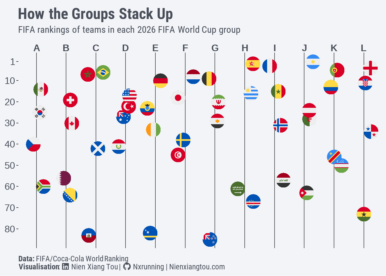
As the rankings of some countries within the same group are very close together, given the size of the image, this creates an undesired overplotting issue. For example, in Group C, Brazil and Morocco only differ by one position. Thus, position_jitter was used to add some random noise to the width position of the data points to better differentiate them.
scale_y_reverse was used to invert the y-axis since smaller numbers represent higher rankings. Although it may not be conventional, putting the x-axis at the top improves the readability in this case since it mimics how we usually read a group table.